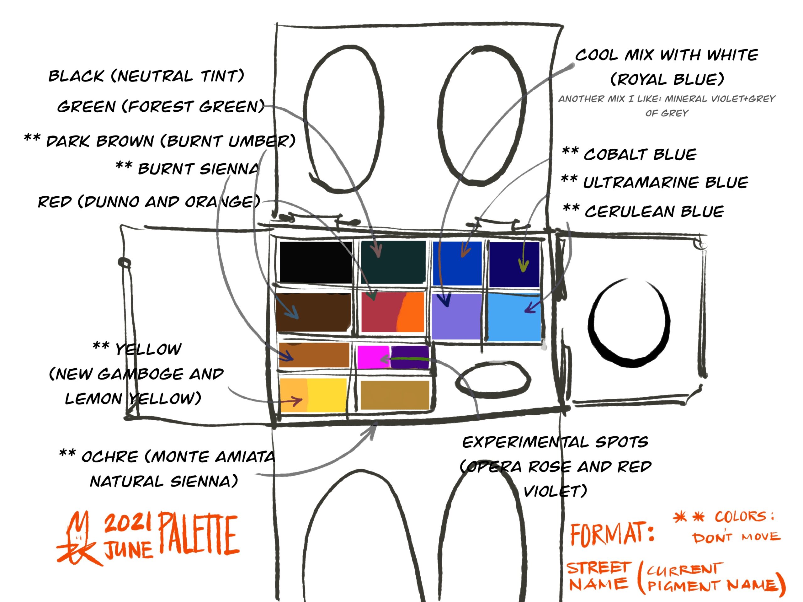
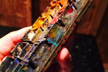
I also make sure that the mixing wells have some sort of warm/cool separation just like the palette has somewhat a separation. The right hand leaf is kept spare until I absolutely must make a pure color or mud color (both extremes) without tarnishing my cool/warm sides. It’s rarely used.
Questions that have been asked in the comment section below but I am repeating here because it’s easy to miss comments. And I thought both questions added value to the article.
Question 1 [Wiltried]
Thank you for sharing! How do you use Neutral Tint? You can mix a nice grey by using Cobalt Blue and Burnt Umber and bias that mix towards warm or cold by adding another color. That saves a spot. Or is using neutral tint quicker for bigger areas?
Answer 1
Perfect solution – about using Blue + Brown to make a very dynamic dark. And with some offset, to have the ability to change the temperature of the mixture.
I use the neutral tint for large shapes like you say (or one can premix these darks) but also for the following 2 reasons:
1. Sometimes, if the inherent color in my palette is a bright color and I quickly want to take it to a complimentary color, then, I can overpower it with neutral tint.
2. I can do monochromatic thumbnails right away.
Sometimes, for months, I will let an empty tub for Neutral Tint exist until I come up with against a painting in which I am losing softness because I am spending time mixing my darks. Awesome question Wiltfried.
Question 2 [Baptiste]
Hey Uma,
Thanks for sharring your palette ! Two questions (and several sub-questions) :
– What’s the brand for Royal blue and why do you have it in your palette ? How do you use it ? does it look like the lavender color or is it totally different ?
– Did you finally find and try a new metal palette ?
Take care !
Answer 2
Hi Baptiste,
The Royal Blue right now is from Sennelier (LINK), and it is my replacement for Holbein/DS’s lavendar. It’s a cool opaque color with white. I use it wherever I need a cool white. My paper tends to warm white more than neutral white, so I can save my whites to get a warm white. Cool whites, I derive from Royal Blue like mixes.
I tried a Korean metal palette (LINK) and love it. It’s bigger and great for my studio work. I’ve not done giant works so far this year, but the Holbein and butcher tray (newly bought) are going to be next in line for use!
Question 3 [Suhita]
Doesn’t surprise me that you’d have only one green in your palette and mix the rest. But I’m curious that one green is a dark one and not green gold or sap green. Say more about this? Do you prefer mixing for fresh light greens but use a premix in the darks? Or is forest green just a quick premix for more mixes?
Answer 3
Hi Suhita! Great question. Hooker’s green entered the palette after many years in Sept 2020 owing to the Lake District work I started. Since the paintings were big, I need one fresh but cooler (temperate region green) color which also was not so strong that I couldn’t lean it warm if I needed to. Hooker’s green was that green – dark but pliable. That led to buying green is similar chroma in brands with a lesser $/oz ratio – that’s why Forest Green from Sennelier.
Green Gold was introduced to me by Tom Hoffmann in Melaque (April 2018) and I’ve been a fan. It’s such a strong and happy color, that I have cared for the tube too carefully. May be after this Forest Green finishes, it will be time to swap it out with Green Gold. Green Gold is so fresh .. and I am leaning towards making melancholic paintings, I did not envision using it there, but may be your comment will prompt a reconsideration. Thank you.


Wiltfried
June 30, 2021 1:53 amThank you for sharing! How do you use Neutral Tint? You can mix a nice grey by using Cobalt Blue and Burnt Umber and bias that mix towards warm or cold by adding another color. That saves a spot. Or is using neutral tint quicker for bigger areas?
umakelkar.com
July 11, 2021 10:59 pmPerfect solution – about using Blue + Brown to make a very dynamic dark. And with some offset, to have the ability to change the temperature of the mixture.
I use the neutral tint for large shapes like you say (or one can premix these darks) but also for the following 2 reasons:
1. Sometimes, if the inherent color in my palette is a bright color and I quickly want to take it to a complimentary color, then, I can overpower it with neutral tint.
2. I can do monochromatic thumbnails right away.
Sometimes, for months, I will let an empty tub for Neutral Tint exist until I come up with against a painting in which I am losing softness because I am spending time mixing my darks. Awesome question Wiltfried.
Baptiste
June 30, 2021 5:47 amHey Uma,
Thanks for sharring your palette !
Two questions (and several sub-questions) :
– What’s the brand for Royal blue and why do you have it in your palette ? How do you use it ? does it look like the lavender color or is it totally different ?
– Did you finally find and try a new metal palette ?
Take care !
umakelkar.com
July 11, 2021 11:02 pmHi Baptiste,
The Royal Blue right now is from Sennelier, and it is my replacement for Holbein/DS’s lavendar. It’s a cool opaque color with white. I use it wherever I need a cool white. My paper tends to warm white more than neutral white, so I can save my whites to get a warm white. Cool whites, I derive from Royal Blue like mixes.
I tried a Holbein and love it. It’s bigger and great for my studio work. I’ve not done giant works so far this year, but the Holbein and butcher tray (newly bought) are going to be next in line for use!
Suhita Shirodkar
July 12, 2021 7:10 amDoesn’t surprise me that you’d have only one green in your palette and mix the rest. But I’m curious that one green is a dark one and not green gold or sap green. Say more about this? Do you prefer mixing for fresh light greens but use a premix in the darks? Or is forest green just a quick premix for more mixes?
umakelkar.com
July 12, 2021 1:38 pmHi Suhita! Great question. Hooker’s green entered the palette after many years in Sept 2020 owing to the Lake District work I started. Since the paintings were big, I need one fresh but cooler (temperate region green) color which also was not so strong that I couldn’t lean it warm if I needed to. Hooker’s green was that green – dark but pliable. That led to buying green is similar chroma in brands with a lesser $/oz ratio – that’s why Forest Green from Sennelier.
Green Gold was introduced to me by Tom Hoffmann in Melaque (April 2018) and I’ve been a fan. It’s such a strong and happy color, that I have cared for the tube too carefully. May be after this Forest Green finishes, it will be time to swap it out with Green Gold. Green Gold is so fresh .. and I am leaning towards making melancholic paintings, I did not envision using it there, but may be your comment will prompt a reconsideration. Thank you.