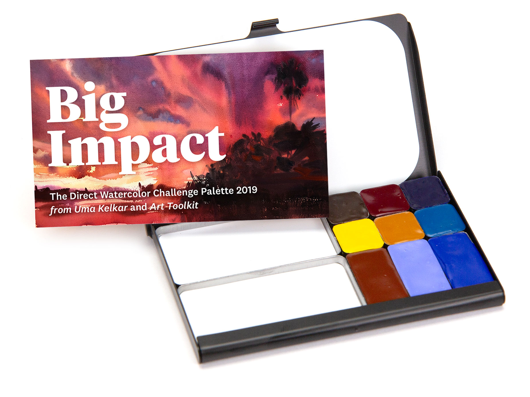
Direct Watercolor Challenge for 2019 is about to begin. And like last year, we have a special set of people hosting and participating in it. The challenge itself is the brainchild of Marc Taro Holmes of the Citizen Sketcher fame. The aim of the challenge is to do 30 direct watercolor sketches/paintings in 30 days without the use of underlying drawing. Last year, he along with 5 other artists co-hosted the challenge. One of whom was Maria Coryell-Martin, the designer behind Art-Toolkit.com, a project where she creates the ultimate compact watercolor palette. Her system is a unique product based on her experience as a travel sketcher in the most extreme locations around the globe. One doesn’t have to be an adventure sketcher to be in on her palettes. With the portable size, this palette gives you an opportunity to experiment with new colors and to own a no-excuse-anywhere palette.
** A limited run of this special palette is on sale now. **
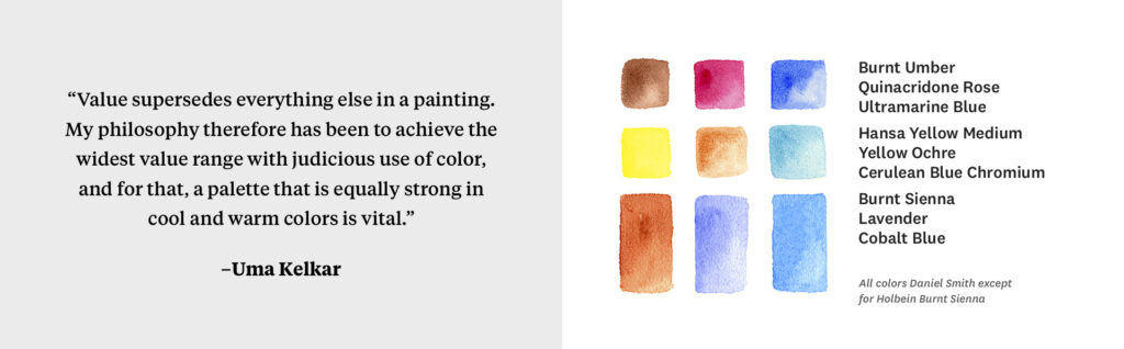
With four blues (two cool, one warm, and one unreal—lavender), four yellows (including browns) and one red, these nine colors can create 585 combinations, from mixes of primaries, triads, and two color mixes. Then one can change the amount of water and you get the point. Short list of pigments is not a short coming. In fact, we have a curated tray.
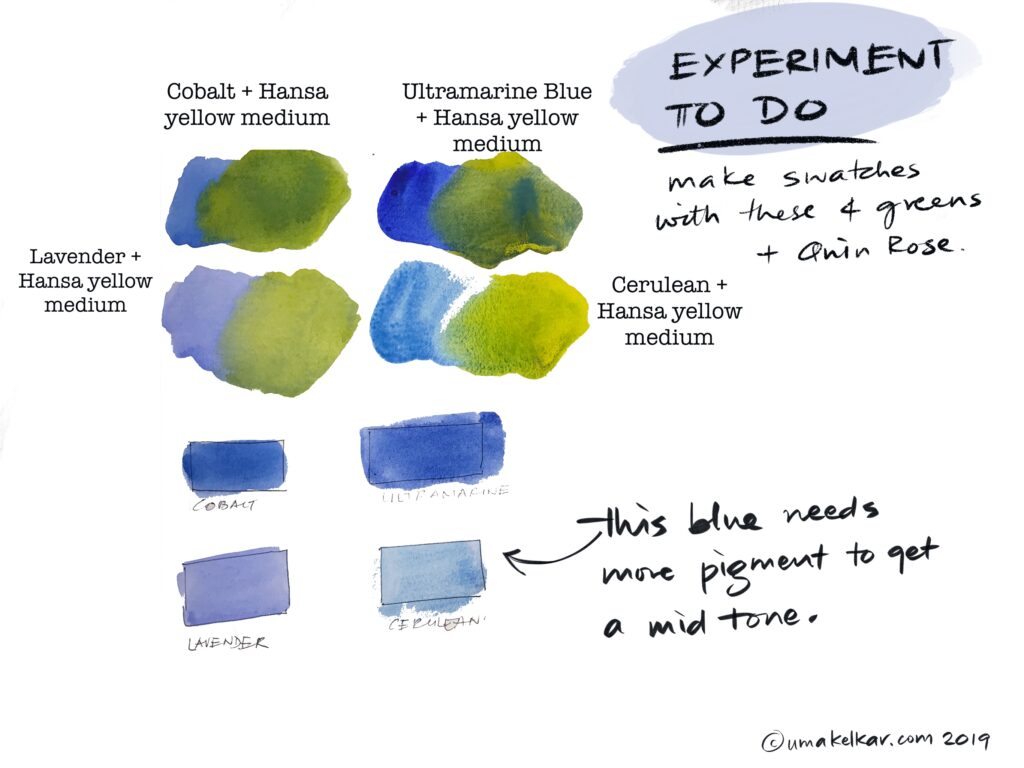
The 4 blues when mixed with the brightest yellow and the dullest yellow give us a range of greens. Not just in temperature, but in innate value, chroma, granulation and opacity. Lavender makes lower valued colors opaque. This is a major takeaway for watercolorists – mixing with lavender circumvents transparency when need arises.
Ochre with Cobalt and Ultramarine give cool neutrals or greens depending on whether blue or ochre is dominant in the mix.
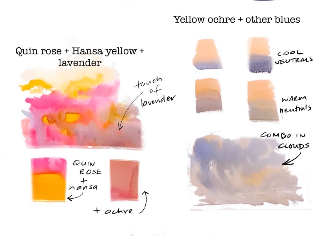
Similarly, mixing Quinacridone Rose (Quin Rose) with both the yellows makes reds, oranges and salmon colors. This particular salmon which is not overly mixed and organic, I especially favor.
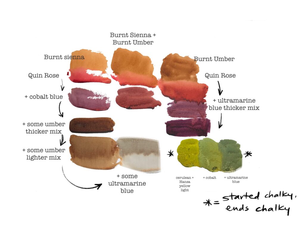
The picture above doesn’t do justice to the distinction between a Burnt Sienna and Burnt Umber, however, they do carry their distinct warmth and coolness into the mixes they make. The above plate is to show that we can make mud when we mix many colors. It behooves us to make this mud deliberately on paper to get used to any palette, let alone Big Impact. It is useful to know what to avoid. Also note, that eventually, this will be the color of cleaning water we make. So if we need a fresh mix of greens but the water we use is muddy, we will be fighting molecules (you can’t beat ’em) and yet not achieve desired result.
Try out the following experiments and then let me know how your play with Big Impact went.
- To the swatches of greens when wet, add a dash of Quin Rose. Which mix gave you an olive green that you liked?
- Let these swatches dry. Then, run a wet brush through this mix. Which pigments lift? Which stain? The color that shows through when you lift is the staining most.
- Did you figure out how to make black? If so, what was your recipe? The world wants to know via your comment below.
- Make a bright violet. Add yellow to it. What color did it turn to?


Marie-Hélène Brohan Delhaye
May 24, 2019 3:15 pmThis is so exciting! I love playing with pigments – very often a painting for me is as much about how the pigments and colours behave as about the subject matter. But I often struggle to achieve darker values. I recently discovered Carbazole Violet (thank you Shari Blaukopf!) and it makes interesting mixes, with Sap Green for instance (a colour I have avoided for years, until I realised it was perfect for Ireland!). I look forward to experimenting over the 30×30 direct watercolour challenge!
boss
June 2, 2019 4:42 pmand I look forward to seeing your experiments Marie. Perylene green is another pigment that can achieve a high value. This pairs with the violet well as well. Off to 30×30 we are!