If you love Potter’s Pink and use it extensively, this article will not resonate.
It will resonate if you are looking for ways to cut-back on the # of pigments in your palette.
No, I don’t despise any pigment. I am trying my best to use Potter’s Pink and see the nuanced way it can aid me but am not at the point where I can opine about it with wisdom. I focus on a basic palette because –
- I have developed acute eye to make neutrals
- I cannot make fresh colors if I don’t use a palette filled with basic pigments that just cannot be mixed using other pigments. These are my primary colors.
Let’s talk about the glow of watercolors aka minor physics.
Watercolors is a transparent medium. So, the glow one sees when one sees a watercolor piece in-person is from part of the incident light traveling through the pigment glaze and then hitting the white paper, reflecting back and impinging on your retina. No, this is not boring. Every additional glaze lowers the amount of light that can ‘percolate’ through the glazes and reflect back to emanate glow. When no light can travel through the glazes, we say the pigment is opaque. A pure opaque pigment applied in thick layer in still shiny and shows color (because it reflects back wavelengths corresponding to that color). When multiple transparent layers overlap they make chromatic mud. And if light doesn’t travel through it, it makes for dead mud (less light, dimmer reflection off the back of the paper). This is the difference between what painters call dynamic darks and muddy darks. Dynamic darks happen in least touches of brush to the paper when one sees darker values in color applied in thinner layers that allow slight glow.
Why a limited palette
Now when you hear the word mix, realize that the mixes made by layering two colors always look more neutral(more opaque, therefore, less colors show) – colloquially, duller. Which layer goes on the bottom matters. Since I avoid touching paper a lot, it behoves me to start with colors that gives me max range of mixes along with pure pigments which cannot be substituted.
Uma’s Limited Palette Suggestions
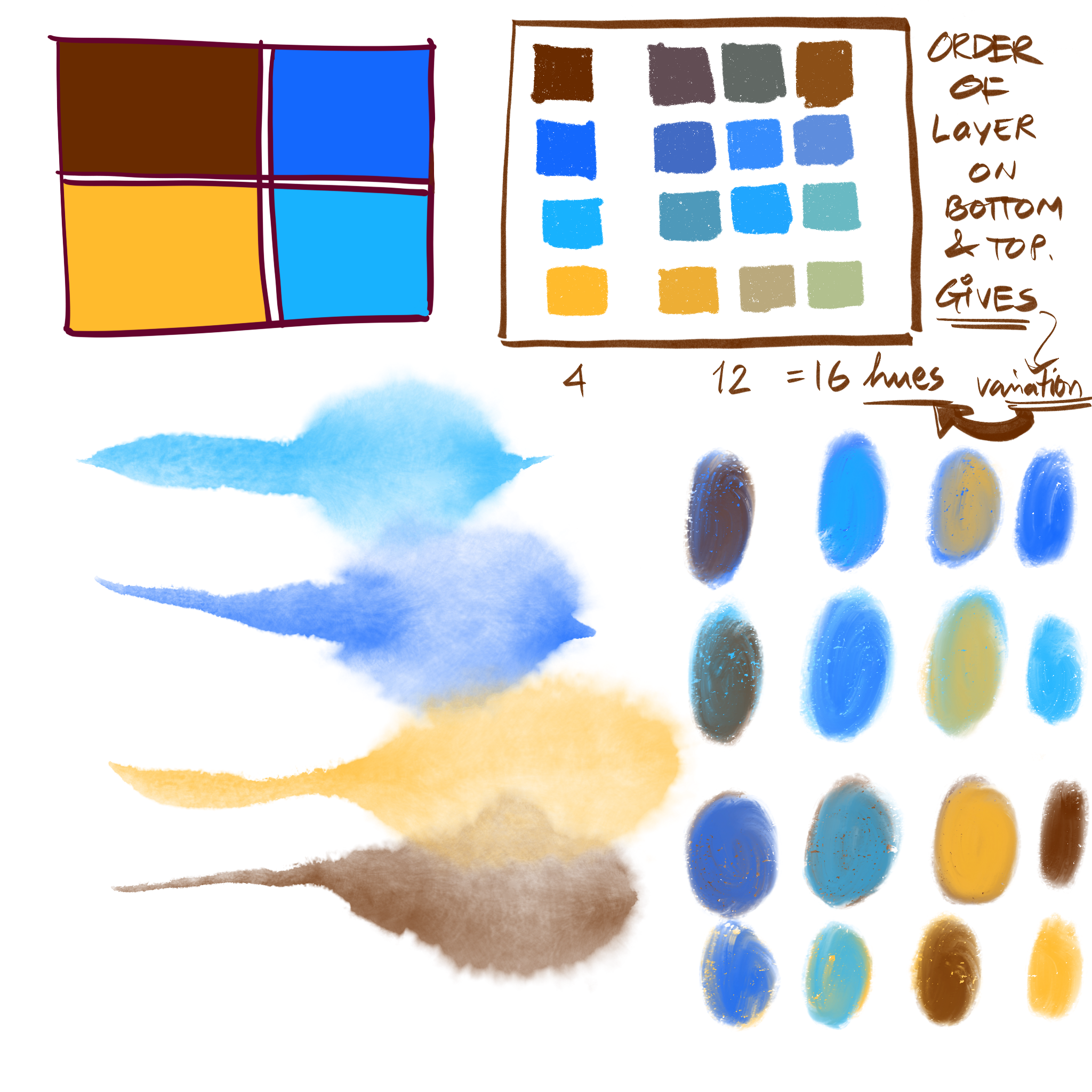
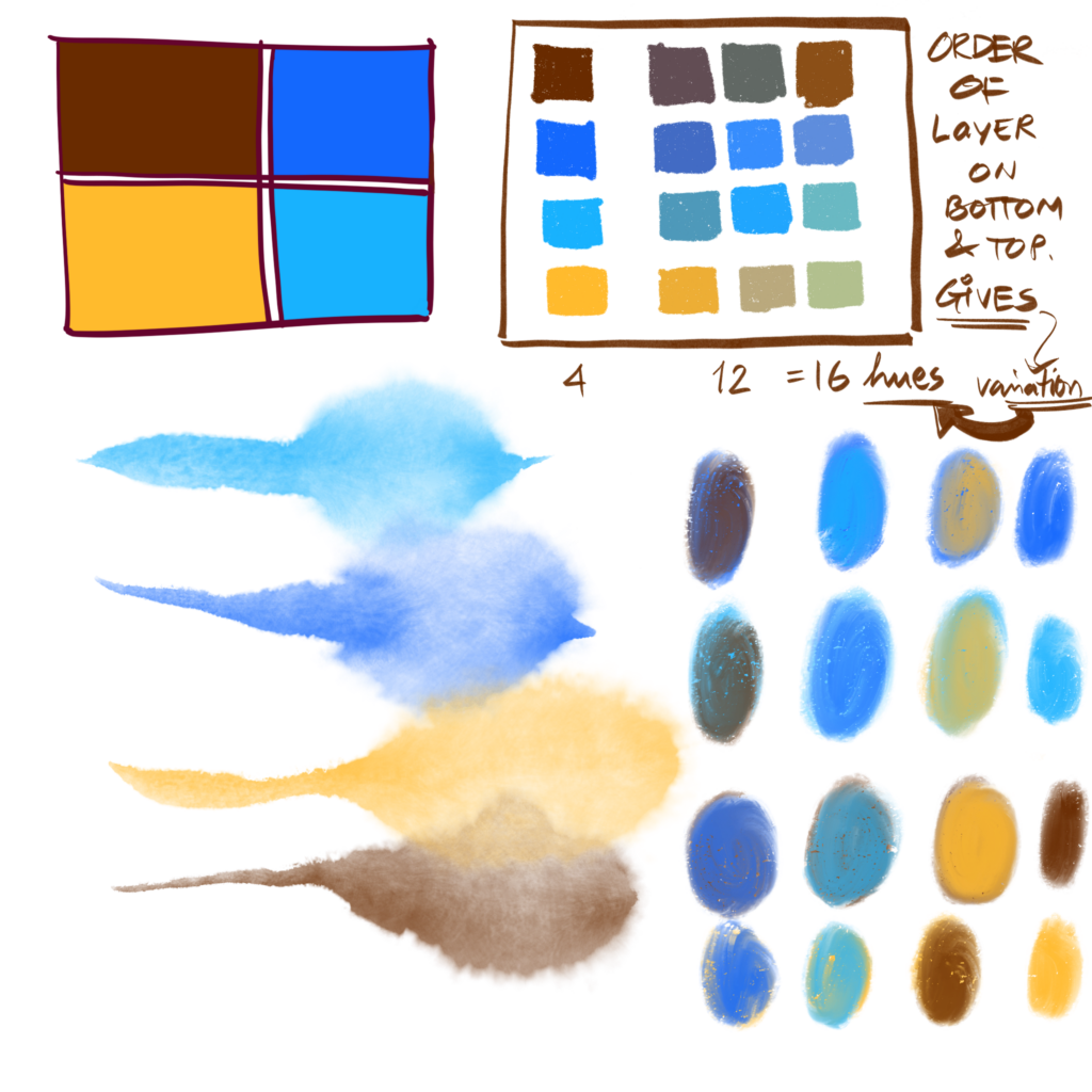
Knowing these truths and having a preference, here is a list of bare minimum colors. Besides the pigments that I picked, you see the experiments of layering in digital land that I did. Then from the act of digital mixing, I picked the color mixes and arranged them in a grid. Showing you that having 4 colors gives a total of 12 hues even when mixing only 2 pigments.
There is a reason I am not naming the pigments here on the chart – can we train our eyes to use colors from a tube and make a judgement based on what we see?
If not having a starter pigment name is crippling, the starter clues are Burnt Sienna, Cobalt Blue, Cerulean Blue, Yellow. Colloquially, brown, California Sky blue, early evening sky blue and mustardy yellow.
If stretched to 6, I get-
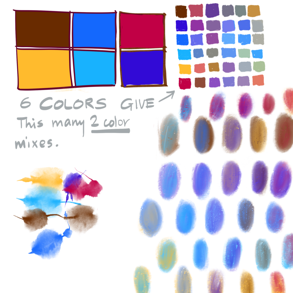
Do you see the power of watercolors over oils in the fact that mixing order helps define the overall color effect? This is a tool that’s not often employed.
-uma kelkar
To learn masterlevel concepts look out for Uma's Masterlevel class. First one happens in Jan 2021. Sign up for her newsletter to be notified.
To get an even more comprehensive and wide range, let’s see what happens when we add a green, our 7th pigment.
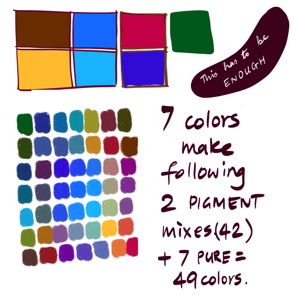
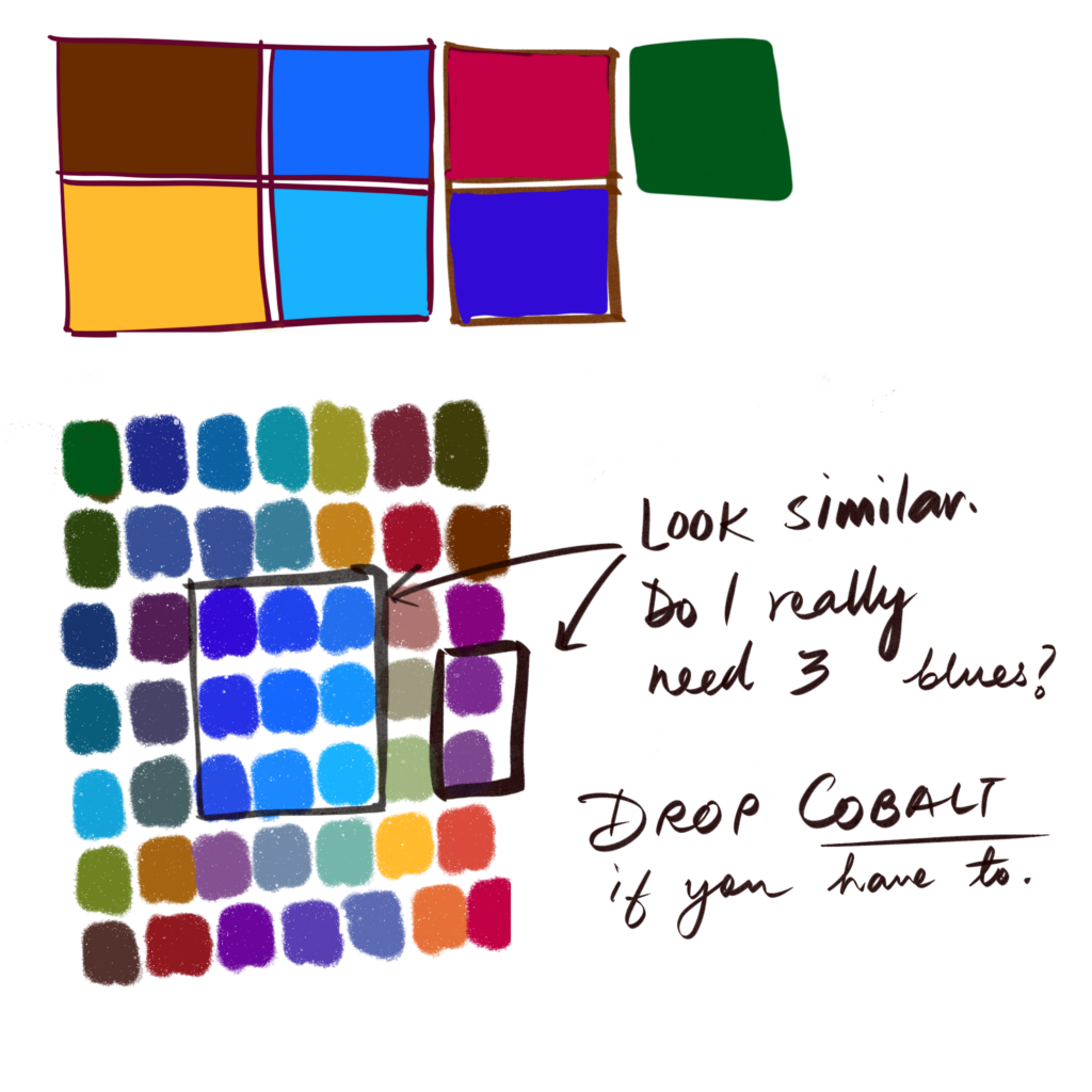
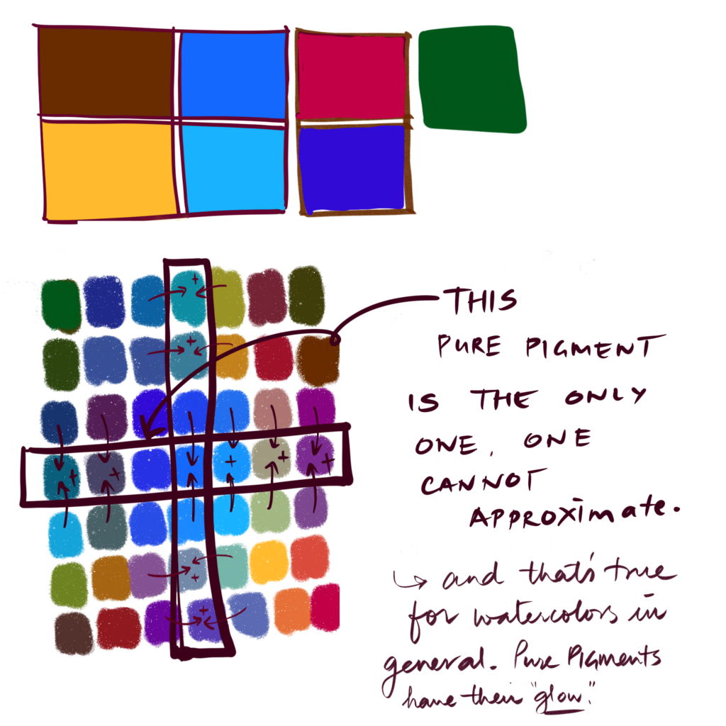
When you drop cobalt, apart from the pure pigment cobalt, most other mixes can be made with 3 pigments. Cobalt intoxicates me, it has a grip over me. If you don’t have this mystical connection to a pigment, drop it. If you are more eco-conscious than me, then drop cobalt again. Most other colors I’ve chosen can be washed in your yard plants.
I don’t have a basic preference, how do I start with a 4 color minimum palette?
- Take a magazine that you were going to recycle. Tear out parts of pages that you find attractive.
- If it’s a complex color, see if you can speak the color.
Example: In terms of food, if the ingredient list contains unpronounceable and non-intuitive names, don’t pick the food is a common recommendation. So, when picking color if you can describe color in basic colors, greenish pink, hot pink, blue, brown it helps. You are looking for the 4 basic colors that repeat. This is your basic and preferred set. - Now, if it’s missing a pure yellow – add one
- If it has a gray/black/white in it, drop it for now. Extreme value pigments are useful – but they make a mess of your cleaning water early on. You can always carry a small extra tube for when you must have white/black/gray.
Why are there no photographs of watercolor swatches here? Digital colors seems a cop out.
- Physics works.
- “A theory is a good theory if it can be proven in 2 different ways”, Brad Osgood, my professor of Fourier Transform at Stanford University.
- You can convince some people by showing proofs. You commit more people when they experience something themselves. Would love to hear your experience in making a limited palette and mixing colors in comments below.
- If you MUST see few of my watercolor experiments, here’s a blog post showing that: https://expeditionaryart.com/blog/2019/05/the-big-impact-special-edition-palette/
- And other artists also follow a similar rubric. You cannot argue with Shari. Check what she has to say – https://shariblaukopf.com/2021/01/13/a-limited-palette-for-winter-and-hopefully-for-summer/


Marie-Hélène Brohan Delhaye
September 29, 2020 9:30 amSo for me, I can’t see myself having one palette only for the rest of my life. I do limit the number of colours for each painting or each project. So I work out a limited palette for a painting or a series of paintings. That can be very time-consuming, which is a problem. I spent the last two afternoons doing colour charts, and rainbow caterpillars, and triads and complementaries, and then mixing darks. So I can see 100% that having a main primary palette with a small number of colours that I can mix to create all the colours that I need is a big advantage. Plus, colour harmony guaranteed! But I have so much fun mixing colours. It’s like a drug to me – doing the colour charts makes me happy. But it’s also a form of procrastination – I know that if I kept my palette small and fully intermixable, I would probably actually paint a lot more. So, in summary, what you’re saying makes perfect sense, but pretty pigments are too addictive. I can’t give them up!!