What was the main purpose of my purchase of this book?
To revitalize my brain to think like a camera man while I composed pictures. The author’s aim is to showcase Production Design for Animation.
What were the most useful things I got out of the book?
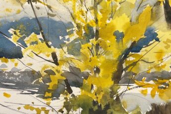
The chapter on camera angles, composition and rhythm in animation could be easily applied to watercolor painting. I realized that because the viewer is in control of how long one looks at a painting, paintings can be nuanced. Whereas, in animation, each frame has a specific and limited time to influence the viewer, so the drama has to be heightened. The book gave me ideas to heighten the feeling of drama I feel in person on a location but which I lose when I put it on paper and then show it to someone who has not visited the spot as I have. While I found the book lacking in some aspects I love to have this book around because at its price point, I feel free to mark it up and play around with the number of visual examples given. It’s like having a library of judicious references handy – reading and playing in the book for 1 hour is a long exercise sure to inspire the reader to want to do the exercises in their watercolor painting too.
What were your least favorite things in the book, or aspects that you wish the book had covered more deeply?
The book quality is similar to self published without an editor looking over the written content and without feedback on readability/font. Some chapters are very thin on depth – especially chapter on color. However, the visual language in those chapters is such that it can make for good group study. This is a book you buy and then share with friends hoping they find some jewels in it. The price of the book also allows me to mark it up with markers, glue and scraps of paper as I played with composition.